BHARAT HONEY
Brand Identity and Packaging Redesign Concept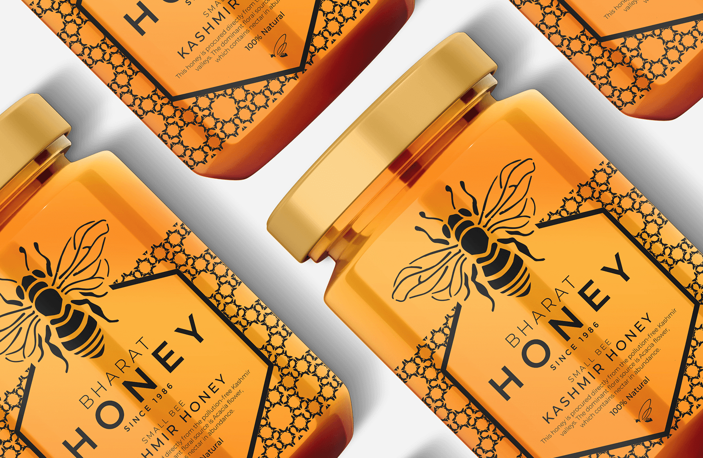
Pure, Natural, Timeless.
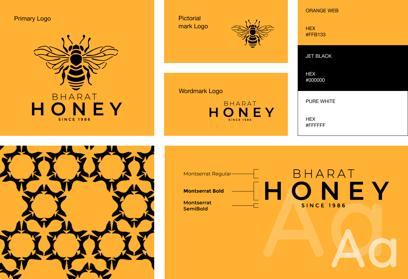
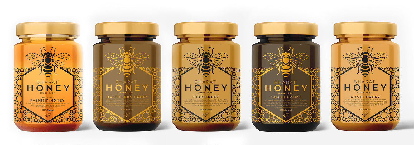
Bharat Honey’s refreshed look adopts a minimalist yet striking design. The updated logo incorporates a friendly bee icon, symbolizing nature’s pollinator and the purity of honey. The label design, inspired by honeycomb patterns, creates a unified and visually appealing package. This concept is crafted to enhance the brand’s identity, emphasizing its commitment to authenticity and celebrating India's rich honey-making heritage.


